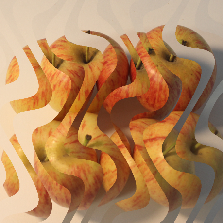
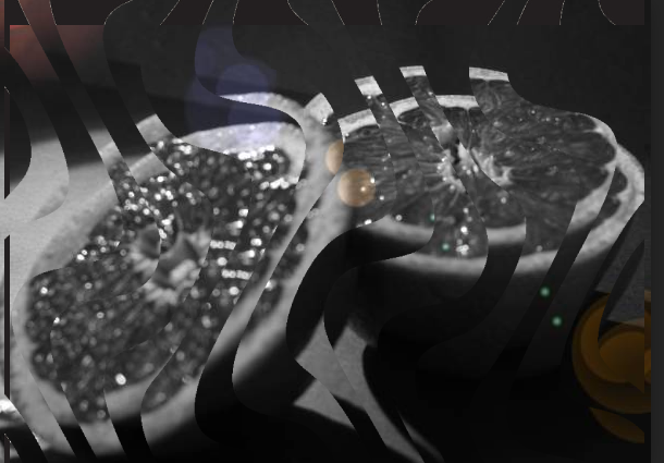
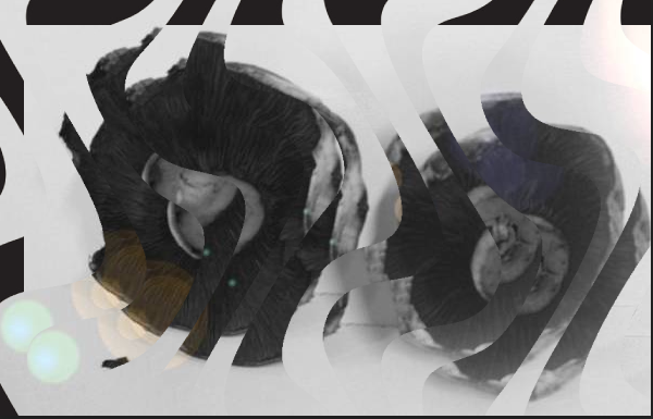
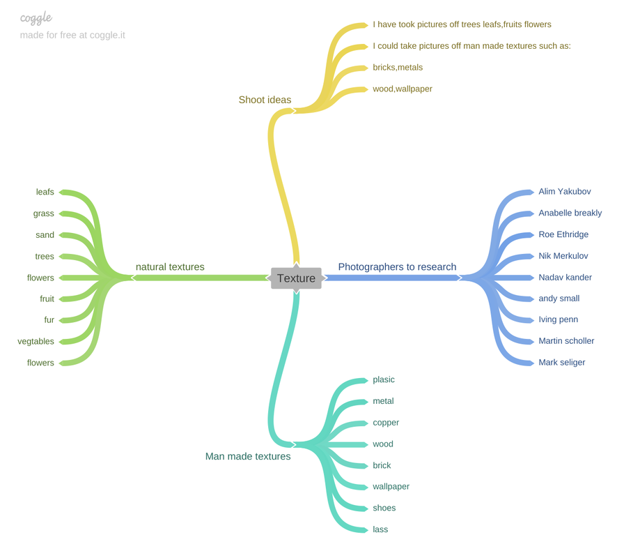
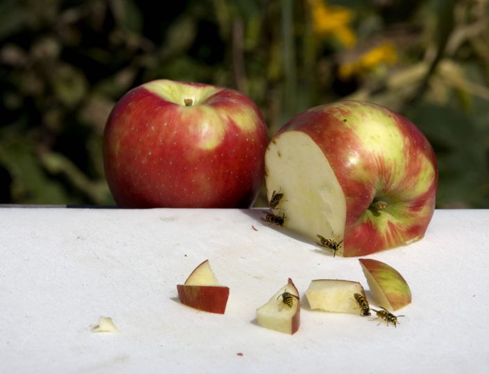
Statement of intent
The theme I have chosen is texture because due to covid I haven't been able to go out as much but I have done some research. Although it's hard to take pictures I will use a studio and take pictures or I could go around near where l live or in school with support.
The research that I want to carry out is looking at different photographers. So far I have looked at Anabelle Breaky, Roe Ethridge,Lucy Shires. I will have taken pictures in the style of lucy shires which are man made textures and black and white. I intend to do a shoot of Anabelle Breaky which is mainly bright colours and fruits. I have done research on Roe Ethridge where I have exploded his work and broke it down.
I intend to take a variety of pictures of my chosen theme. I will alter my pictures to the best of my ability and make them eye catching to the viewers. I am going to do a shoot on natural textures such as wood,grass,concrete and leaves. I am also looking to do a shoot of fruit and veg in the style of Anabelle Breaky and include bright colours to make it stand out.
Lucy Shires does photo shoots of man made textures and often makes them a blueish tone whereas Anabelle Breaky does bright colours and fruits. This would make my website stand out because ones darker and ones brighter which would look amazing.
The techniques I would use are birds eye view and worm's eye view. I would use a birds eye view to show the full image and show it for a high angle. Whereas the worms eye view you would zoom in on one thing in particular and only get that in the image. Also you would use a low F-Stop for a birds eye view and a high F- Stop for a worms eye view. A high F stop would be used because in a studio there is no natural light and the only light i would be using is the lights in the studio.
What I would love to learn about is more photographers and how they would take pictures in their style. Also I would love to learn different techniques and take photos to the best of my ability.
My final format would be on a website with my photos with a lot of description of what I used and the steps leading up to them. Also i would do mood boards of my favourite photographers and describe what they used and their background. The edits that I would love to do are black and white because its not something everyone does and its unique. Also I would love to do edits that manipulate styles of photographers and i would like to change the colours of certain photos.
Analysis
Context
American artist Roe Ethridge's latest book takes its title from the French "C'est pas du luxe", an ironic phrase which alludes to the superfluous nature of luxury whilst proclaiming how essential it is to existence. Such paradoxes are fluently woven through Ethridge's oeuvre and Le Luxe encompasses his practice from the past decade, without ever slipping into the moribund gravitas of a retrospective.Composed in three parts, Le Luxe contains an unusual backdrop, the everyday of the artist, who worked from November 2005 to January 2010 on one commission documenting a building in downtown Manhattan on a site adjacent to the World Trade Centre. This narrative offers an uneasy balance to the fissures between analogue and digital and Ethridge's consistent undermining of his own certainties.
Roe Ethridge was born in 1969 in Miami and received a BFA in Photography at The College of Art in Atlanta, GA. Ethridge's images emanate from his direct experience of the world. His focus is multiple and restless as he works to capture the vivid and intimate details of his various locales. In doing so, he moves freely among the classic genres of the photographic medium - portrait, landscape, and still life. some of this information I got from https://www.mai36.com/publications/le-luxe
Content
In this photo I can see two bright apples with a green background. This is a still life photo. It is realistic because there are wasps eating the apples ,the apples are abit bigger then the wasps so this could suggest that the photographer is trying to say that people eat abit too much that they can handle .In my opinion the idea behind this work is to show that if you waste food it would be left to waste. The colours being used are green and red which are complementary colours. This photo is called “Cest pu du luxe "which translates to if you buy too much food it will go to waste which is being shown in this photograph. The photograph could represent how greedy the wasp are that they do not care how much they eat and this could show how society is. I can see the white table has stains which looks like they have come from the apple or the table is just genuinely dirty. I can also see that one apple looks like it has not been cut opened or anything it looks like its just there for show. The back ground looks like a green screen to make it seem like they're in a forest or a jungle I think they did this to try fit it in the theme of nature.
Composition
this photograph is a still life which gives us more of a natural shot. The first thing we see in this photograph are cut apples with wasps on them. The apples are placed in the middle and have been shun by the light. I can tell this photograph was took in a studio, and he used a bright studio light because there is no natural light in the studio. The depth of field is small and the background is blurred out so it makes our focus on the bees and apples only. A low f stop would of been used because the background is not in in focus. There would of been a ISO of 200-400 because the picture is grainy. The white balance of this would have been set to tungsten because this is a studio shoot. I think a tripod would have been used because there a bees that are alive in this picture so to catch them he would need to be fast and using a tripod would help him. Also a super fast shutter speed would have been to catch the flying bees. The middle ground would be the apples and the bees because as you can see they're the ones in the middle. to me I feel the leading line of this photograph would be where the edge of the table ends and the background. The sweet spot falls on the apple and bees.
Connection
This links to my theme because I will also look at natural textures, The image focuses on fruit and insects . The photographer has done well with this picture as he captures the bees feasting on the apple and also has a good meaning behind it which I totally admire. The meaning is that if you eat too much it will go to nature. This is an important message because it is telling society to stop wasting food and to stop biting off more than they can choose.
comment
I like this picture because it has a very good and moral meaning behind it and it could really change society's view on food waste. The positioning of this picture will inspire me to take pictures with political meanings. I also think this will have a massive impact on the youth today because nowadays people especially younger people they have a habit of wasting food. This picture could show them to not take food for granted and to appreciate everything in life just not food. I like the use of the colours because they compliment each other and the photographer has done this very well.
Anabelle Breaky
Context
Annabelle Breakey is a food, still life and lifestyle photographer based in San Francisco. Her work has appeared in advertising, editorial, cookbooks, print and web campaigns worldwide.
A graduate of the Academy of Art University San Francisco in 1990, Breakey’s work ranges from natural-light food photography to highly technical product photography to manipulated conceptual composites. Whether shooting an editorial still life bathed in natural light or an iconic product shot, her style is recognizably clean and fresh.
The Annabelle Breakey Photography Studio, located in the Dogpatch neighborhood of San Francisco, has a reputation for a joyful atmosphere that’s a pleasure to work in. Breakey purchased the 2,000-square-foot space in 2010 as a blank slate and had it custom built as an open floor plan with room for multiple sets, a large gourmet kitchen, a well-stocked prop room and a wall of 14-foot windows that flood the studio with natural light.
Her stylists, assistants and studio staff are the best in the business and enjoy the process as much as she does. All of the digital imaging and retouching work is done in-house whenever possible so that each image is delivered to perfection from start to finish.
Breakey’s recent clients include Starbucks, Burger King, McDonald’s, Gorton’s Seafood, Taco Bell, Sunset Magazine, Chronicle Books, Method Home and Logitech. Her work can be viewed at AnnabelleBreakey.com. some of this information I have got from https://ediblesiliconvalley.ediblecommunities.com/annabelle-breakey
Content
In this picture I can see a feminine hand holding grapes with juice gushing out like blood with a light green leaf on top .This picture is figurative as you can clearly see the objects infront off you. The tittle of this photograph is called weird and wonderful .This picture is realistic because if you squash grapes juice will gush out like no tomorrow. I can see the green stem is still on the grapes which goes really well with this picture because it really stands out. The women is wearing 3 rings which look really expensive, one of them could be a wedding ring or an engagement ring or could have just been there for the shoot. The rings look really shiny which captures our eyes especially the big one on the far right. The women's sleeve matches the background which I think was intentional rather than a accident. The grapes look like they have not been washed because you can see some of the white stuff on it so you can tell they have not been washed.
Composition.
Breaky uses central focal point because it will draw attention to the viewer. The background is pink but in the middle there's an explosion of juice. The light being presented is coming from the camera that is taking the shot. We can tell she is uses a low f stop but, is also hard to tell because of the backdrop. The juice dripping down would require 1/8 second shutter speed to catch it. Due to how its been took it could be used for a glossy magazine or an advert for the Jewelry. The rings could are quite regal and remind me of Roman empires and queens from the past. Quiet often Romans and queens would eat grapes. There's a lot of light in this photo which suggest that there has been a spot light in use because it is in a studio. There would have been a low ISO for this picture because it is smooth rather then rough. I am guessing the white balance would have been set to tungsten, flash or fluorescent I know this because this photo was taken indoors. The rule of thirds has been applied because the fruit and her hand are in the center which also allows us to get a clear image of the picture. A tripod could have also been used to be quicker and also capture the juice. The sweet spot falls onto the grapes as it is the first thing that captures our eyes.
Connection
I like this picture because it really shows out the grapes and the juice dripping out .It can show different meanings such as if u pressure something or someone it will explode or if u hold down the berries you get berry juice. I also like how Central camera is being used and how the background stands out and catches the eyes off viewers.
Plan for shoot
description of aim shoot
Take pictures of bright colour fruit with a bright background potentially cut up fruit or a whole. I will use complimentary colours aswell.
link with photographers
I will take these pictures in the manipulation style of Anabelle Breaky.
location
My location for this shoot will be in the studio.
camera settings that I will use
I will set my white balance to Tungsten
Grapefruit
Best image |
worst image |
Cabbage
Worst image |
Best image |
This my worst pictures because they are not in shot and you see the background. Also the picture is not in focus it was also abit to bright .To make it better i must get a better angle and not get the background in.
|
This is my best one because it is clear and the iso is high which allows the light in to cause the picture to be clear and the aperture helps it to be clear.
|
Tomato
This is my best picture because it shows different textures and the picture is taken from a birds eye view. It allows you to view the whole image so you can get a better understanding of the image.
|
This is the worst one because it is not clear and there is no iso because the picture is not bright. Also the arrangement could of been better.Also you can see the black line in the background. |
Apples
Best image |
Worst image |
This is my best image because it is in focus and you cant see the background and the apperture is high so there is light.The iso is also high because the picture is bright
|
This is my worst because it is not in focus and not clear also its a basic picture because no iso was used. The arrangement could of been better.
|
Lucy Shire Mood board
Outdoor images
Best image |
Worst image |
This is my best image because it has a low iso so it isnt graidy. Also the spider webb is clear and it stands out. The lower the iso the more low the depth of field. The smaller f stop in this picture allows the picture to be blurred and focus on the foreground.
|
This is my worst image because it is blurry because the camera wasn't still. It had a large f stop which blurred out the whole picture. Also the shutter speed was slow which lead to the picture to be blurry.
|
Best image |
Worst image |
This is my best image because the broken door brings out many colours such as dark green, light green and brown. The white balance used brought out the many colours. The image has strong leading lines that bring focus to the rotting woods. This picture is pretty much in the style of lucy shires because the top of the image goes out of focus whereas the bottm focus is the standing point.
|
This is my worst because the central focal point is unclear and blurry because i have used a large F stop to make this out of focus and a bad picture. There is a low white balance which makes the picture dark and gloomy also you cant see the texture of the polystynre object.
|
Natural textures.
Best and worse
Best Worse
This is my best image because it shows a clear image of the tree and you can see the background that makes it look multi coloured and you can tell i have used a low whit balance.The back ground also makes it stand out.The background and foreground is in focus so a high f stop was used.
|
This is my worst image because there isnt much going on and the picture is dark which makes it boring.Also a low f stop was used because not all of the background was in focus.
|
Final shoot
Macro lens
Sprouts
Flower
I found the macro lens really hard to use but as I took more pictures I got the hang of it and steadily improved.
Worse
This is my worse image because I have used a high f stop which causes the picture to go out of focus. Its also bad because you cant really tell what the picture is of because the camera has been placed so low you cant tell. Also the sun lighting coming in makes it too bright I should have used a appropriate white balance for this picture.
Wood/tree
Best |
Worse |
This is my best image because I have used a low f stop and a worms eye view also there is a range of textures and colours that come in together nicely. For example the green on the tree looks likes it ripping away and underneath theres white which plays in nicely. The background is out of focus and the center of the tree looks likes its exploding like a volcano.
|
This is my worst image because the worms eye view used is too close to the picture which doesn't allow the full picture to get in focus. Also you can only see a minimum amount of the picture the background is in focus and it is dark a better white balance could of been used.
|
Manipulation on the style of Lucy Shires
Steps for the product.
Final product
For these images I cropped them to make them fit into the website. Then I added black and white in the style of Imogen Cunningham, changing the brightness and contrast to make the image more interesting. Then I added lenses flare to make it stand out.
Clipping tool edit
Evaluation
What was the project theme and what did you think about it?
The project theme was texture. As the first project we did it was very enjoyable because I had the opportunity to look at different colour textures and different texture types. I think this project was really interesting because I learnt alot of textures which I was not aware of before.
What part of the project did you enjoy the most?
My favourite part of this project was going out of lessons and onto the playground to look at different textures. I really enjoyed this because I had the chance to look at different complimentary texture colours as well as different plants. For example in my work I have taken a picture of a school door and in that door there are different colours coming off it which complement each other and it makes the door look outstanding. I also really loved editing my work because it gave my work a whole different look, especially the black and white edits which you can see on my website. I also found the manipulations really interesting because it made my work look like the work of professional photographers. This took my work to another level.
What new techniques have you experienced?
The techniques that I have learnt are Birds eye view which is an angle up high with a camera and a worm's eye view which is a low angle view with a camera. I have also learnt the difference between a high and low f stop as well as a fast and slow shutter speed. A high f stop is when less light enters a lens whereas a low f stop allows a lot more light in the lens. A fast shutter speed will allow you to catch stuff going at a fast pace such as if you are throwing a ball the camera would catch it using a fast shutter speed. However if using a slow shutter speed it will not. ½ would be really fast for a shutter speed whereas 1/1000 will be rather slow. A white balance in photography is the adjustment of colours to make the image look more natural.
Which photographers did you research in this project?
The photographers I researched during this project were Annabelle Breaky and Roe Ethridge. Annabelle Breakys work really intrigued me to research her because I really admired her use of bright backgrounds and bright fruits which often complimented each other and looked really well done. Her work stood out to me because it was something really unique and useful and could have been used for a glossy magazine. On the other hand Roe Etheridge's work was rather gritty than bright; it had the use of flies,animals and a really gloomy background. The image I am talking about in particular is “C'est pu du luxe”. The meaning behind this image speaks volumes to me which is if you buy too much food it will go to waste. I really like this because he is using photography as a way to spread awareness of food waste.
What do you think was your most successful part of the project?
I think my most successful shoot in this project was my last outside shoot of the flowers. I think this was my most successful because as it was my last shoot. I feel that I had gained certain skills and techniques which helped me with this shoot such as bird's eye view, worm's eye view and central focal point. I feel as if I have mastered all these techniques in my last shoot because over the past few shoots I had been working on them and other techniques but from my website you can see all the hard work has paid off.
What would you have done differently?
What I would have done differently in this project would have been to take more quality pictures. From my website you can see at the start my photographs were not that good and they were low in quality and quantity. However my photos started to improve later on but i also did not take enough pictures to improve my work and achieve a higher grade. Also due to covid and me not being able to attend live lessons i missed out on a lot of edit work so i would have loved that if i got given this project again. I also would have wanted to go on trips such as Lake District and London but due to covid restrictions we were unable to attend these trips.